Solar hot water

It’s just gone the end of winter and we’ve installed a 300 litre evacuated tube solar hot water system.

solar_hot_water_20160828

At first I wanted a split system so I could protect the cylinder from the extremes of winter night-time temperatures but then I realised they require some hot water to be circulated through the pipes during the night to prevent freezing. In the end I went for the integrated system pictured above. The cylinder is outside (see my earlier post) but it’s simple, no pumps, no controller, no moving parts.

The first few sunny days at the end of winter saw the hot water electricity consumption drop from 15 kWhr/day (for the old electric heater) to 0 kWhr/day (solar plus electric booster). We are doing our part to decommission one of Australia’s old coal-fired power stations without adding any incentive to replace it with nuclear.

How much the electric booster gets used over 1 year remains to be seen but it’s looking promising. I’ll report back in 12 months.

Posted in Uncategorized | Leave a comment

Why is kinetic energy proportional to velocity squared?

It’s easy enough to find a derivation of the equation KE=½mv² but more difficult to find an explanation that doesn’t rely heavily on mathematics.

I want to show that when an object’s velocity (v) changes in a linear manner, like 0, 1, 2, 3, 4, 5, etc., then it’s kinetic energy (KE) will change like 0, 1, 4, 9, 16, 25, etc. The challenge is to come up with a quantitative answer but using easy to understand concepts and avoiding calculus.

1. Velocity=1

Start with two identical masses, m1 and m2, each with it own spring attached. The 2-mass system starts off with a velocity of zero, vs=0, and with the springs touching and held in compression, like in the diagram below. The total energy in the system is 0+1+1+0 being the KE of m1 plus the potential energy in each of the springs plus the KE of m2.

velocity_equals_1_kinetic_energy_proportional_to_velocity_squared_so_equals_1

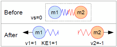
After the springs are released m1 shoots off to the left with velocity v1=1 and m2 heads in the opposite direction with velocity v2=-1. The potential energy in the springs has been changed into the kinetic energy of the objects so KE1=1 and KE2=1.

It doesn’t matter about units because whatever units are used (joules, kilograms, metres/second, etc.) the progression of velocities like 0, 1, 2, 3, 4, etc. should result in a progression of KE’s like 0, 1, 4, 9, 16, etc.

2. Velocity=2

Now, while m1 is travelling to the left with velocity v1=1, bring it into contact with another object, m3, and compress their springs like in the diagram below.

velocity_equals_2_kinetic_energy_proportional_to_velocity_squared_so_equals_4

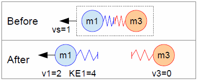
The trick is to consider the total energy in the system before the springs are released and then work out what is the energy in m1 after the springs have done their work.

Before the springs are released the energy of the system is 1+1+1+1=4 being the KE of m1 the potential energies of the springs and the KE of m3.

After the springs have been released m1 is heading to the left with velocity v2=2 and the velocity of m3 is v3=0. Because m3 is stationary it has no KE so all the system’s energy must be in the KE of m1. So KE1=4.

3. Velocity =3

velocity_equals_3_kinetic_energy_proportional_to_velocity_squared_so_equals_9

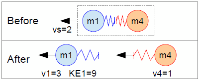
Now repeat the process outlined in the previous section. First look at the energy in the system before the springs are released. It’s 4+1+1+4=10. Then, after the springs have been released, subtract the KE of m4 from the total to find the KE of m1. KE1=9.

4. Velocity=4

velocity_equals_4_kinetic_energy_proportional_to_velocity_squared_so_equals_16

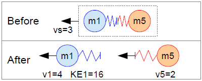
Energy in the system before the springs are released is 9+1+1+9=20. KE of m5 after the springs have been released is 4 so KE1=16.

In the same way:

For v1=5, KE1=16+1+1+16-9=25

For v1=6, KE1=25+1+1+25-16=36

It looks like kinetic energy is proportional to the square of velocity. Knowing how to derive this relationship without using calculus might not help with our day-to-day energy decisions except to show how a quantitative answer to a problem can sometimes be found by breaking the problem down to simple parts and basic principles.

Posted in Physics | Tagged , , , , , , | Leave a comment

How do pelmets work?

How does a pelmet reduce heat loss or air flow? I typed something like that into Google and came up with lots of sites saying pelmets reduce heat loss in winter by reducing the flow of cold air from windows into a room. Couldn’t find any references to any tests done on the effectiveness of pelmets so I thought I’d conduct my own qualitative analysis by thinking about how pelmets might work.

I used Sketchup to draw the pictures in the image below.

winter air flow between window and curtainThe arrangement shown in A has a curtain sitting out from the wall and with a gap between it and the floor so the arrows indicate cold air flowing off the window and into the room and being replaced by warmer air flowing into the sides and down from the top. B shows the sides of the curtains sealed or touching the wall so the air flow is simpler than in A. C has the top and bottom of the curtain sealed against air flow but cold air can still enter the room. D shows the bottom and sides sealed so the cold air between the curtain and window has nowhere to go and stays pooled in the gap.

cold air flowing out from under a curtainIn E the top and sides are sealed but the bottom is open so cold air can still flow into the room and get replaced by warmer air from near the floor. Cold air is a fluid which is slightly heavier than the warmer air in the room so it flows, like a liquid, just slower.

In all of the examples above the only one which looks like it would prevent the flow of cold air into the room is D. The effect of a well-sealed pelmet is shown in C and E but in both those examples cold air flow is still occurring.

Another way of visualising air flow is to take the example B where the sides of the curtain are sealed and look at it in cross-section, like below.

curtain and window cross-section showing air flow with and without pelmet

The left-hand figure shows warm air flowing in the top and cold air flowing out the bottom. The middle figure shows a traditional pelmet in place and a clear path for the air to flow. One thing to consider is that the air is flowing slowly which means it will easily find its way around obstacles and through gaps. The right-hand figure shows the cold air pooled in what is effectively a vessel. It appears that as long as the sides and bottom of a curtain are sealed against air flow it won’t matter if a pelmet is in place or not.

So to answer the original question about how a pelmet works, at a guess, I’d say that pelmets don’t work. Summer is a different question but can be visualised by reversing most of the arrows so that to prevent hot air flowing into the room imagine the gap between the curtain and window is a vessel holding a lighter-than-air gas.

Posted in Uncategorized | Tagged , , , , , , , , , , , , , | 13 Comments

Energy in equals energy out

Following on from the previous post I did a quick search for an easy way to understand the energy balance of the Earth’s surface and found the following diagram “Breakdown of the incoming solar energy” by Frank van Mierlo at http://en.wikipedia.org/wiki/File:Breakdown_of_the_incoming_solar_energy.svg

All the radiant energy coming down to the ground from the sun will eventually head back up from the ground in one form or another. Houses in warm climates are often designed to prevent direct solar radiation from entering windows but little is done to prevent the entry of indirect energy coming back up from the ground. Averaged over the Earth’s surface a fair amount of that energy is in the form of latent heat in water vapour but if a house is surrounded by hard surfaces then the energy heading up will be mostly radiation.

The reflectance of various hard surfaces can be found in the table “Solar Albedo of Concrete and Select Other Materials” at
http://www.lehighcement.com/Education/Lehigh-Education-Strange-but-true.htm. If the hard surfaces are a light colour to prevent the heat island effect then they can reflect and scatter up to 80% of visible light and short-wave infra-red into windows. This is a much greater reflectance than that of the average Earth surface which is about 5%. A dark coloured surface will get hot, heat the air in contact with it and radiate long-wave infra-red.

On the shaded side of a house it might be a good idea to have window glass which allows transmission of visible light but blocks infra-red, keeping a lot of indirect radiation out during summer and keeping heat in during winter. Keeping the ground around the house shaded during summer is probably a good idea too. That’s cool shade rather than the hot shade I alluded to in the previous post.

Posted in Uncategorized | Leave a comment

How shape matters

On a recent evening, whilst walking past a wall which had been in the sun all day, my brother made the observation that he could feel the heat coming from the wall but when he touched the wall it hardly felt warm at all. It’s an interesting observation because it seems to be counter-intuitive. Normally, if we can feel heat radiating from something then it is quite warm to touch. I think that what’s happening can be explained by considering two things; perception and radiant energy.

Radiant energy (light, infra-red, sound, etc.) comes from a source (the sun, a fire, a speaker, etc.) and most sources can be thought of as a point source if we are far enough away from them. The energy falling on a receiver, your hand for instance, drops off rapidly as you move away from a point source. It follows the familiar inverse square rule which is shown as the red line in the graph below.


When the receiver is close to a source then the point source approximation may no longer be appropriate. Another approximation is for a source which is in the shape of an infinitely long line. For a line source the radiation drops off following the inverse rule (i.e. the inverse of the distance from the source rather than the inverse of the distance squared) as shown by the yellow line. From the point of view of our perception there might not be a lot of difference between the inverse rule and the inverse square rule. But wait, there’s more.

If the receiver is close to a source which is a plane then a suitable approximation is that of an infinite plane. For a source which is an infinite plane the energy doesn’t drop off at all, no matter how far the receiver is away from the source, as shown by the blue line. In practice though, as a receiver moves away from a planar source the energy decrease first approximates that of an infinite plane (when the receiver is close to the plane) then ends up looking like the source is a point (when the receiver is a long way away from the plane). Something like the black line.

So when my brother could feel the warmth radiating from the wall he was close to it and in the infinite plane approximation part of the black curve. As he approached the wall and touched it the energy didn’t increase much at all so it felt cooler than what he expected.

Knowing how a planar radiation source behaves does have some practical applications, particularly in house design. A common feature of houses (especially in Australia) are eaves or verandas made of corrugated sheet iron. These features are meant to shade the house from the summer sun but what they do is convert the incoming solar radiation to heat then act as planar sources and re-radiate the energy as infra-red onto the house. Another often ignored planar source is the ground. Windows shaded by eaves or on the shaded side of a house are often ignored as sources of heat coming into a house on a summer day but they allow heat from the ground to enter. The ground can get quite hot and radiate infra-red or it can effectively reflect and scatter solar radiation and it definitely approximates an infinite plane.

Finally, in areas prone to bush fires or forest fires designers need to be aware of the difference between a heat source which approximates a point source and one which might approximate an infinite plane. For example, if we are standing near a bonfire then we move away from it we’ll feel the radiant heat decrease quite quickly. By contrast, a fire front which might be describes as a wall of flame will push the radiant heat out in front of it for a considerable distance.

Posted in Uncategorized | Leave a comment

Why not nuclear

This morning on a US Tech Coast Angels (TCA) webinar (www.techcoastangels.com) the chairman of TCA, Richard Sudek, was asked what deals are interesting investors at the moment. He said that green-tech, including solar energy, have been hot for some years and are still hot. The areas sophisticated investors are putting their money into now is a good indication of what technologies they believe will be winners in 5 to 10 years when they are looking for a return on their investment. They conduct thorough due diligence in the deals they invest in and they put in a minimum of $25,000 when they do invest. Anyone can have an opinion that costs them nothing but when that amount of money is being invested by private, knowledgeable investors maybe it’s saying something more than opinion. Anyway, here’s my opinion:

When I was a bout 15 I polished the inside of a steel wok, took it out into the sun and felt the concentrated heat at the focal point of this pseudo-parabolic mirror. That was about 35 years ago and I’ve been following the debate about energy sources in Australia ever since. One thing that hasn’t changed in that time is the debate between those who are pro-nuclear and those who aren’t. On both sides of the debate are credible scientists, engineers and economists and to the interested observer the debate seems to be never-ending with claims followed by refutations followed by counter-refutations. Now that we are experiencing increasing pressure to make some serious decisions about our energy future how are members of the public supposed to decide which path to support?

It’s an interesting question because a nuclear energy future for Australia is not something we would enter into in a small way. It would have to be a major commitment to make the investment worth it. It’s not like we would decide to build just 2 or 3 small nuclear power plants to see how they go. So the old saying “you are either with us or against us” will hold true for a lot of people. There’s no simple answer so the best thing is to become informed then choose which club feels right for you. When you’ve chosen the pro or no-nuclear club you’ll find any number of credible sources of information to back you up. Like the photo above, turn it upside down and you can still see the sense in it.

I’m on the no-nuclear side of the debate. When I look at the most credible sources on both sides the pro-nuclear side just doesn’t seem as convincing. I can’t say why without having my reasons refuted, it’s more of a gut feeling. OK, I’ll be a little more specific. Here are three reasons why I think the non-nuclear future for Australia is a better one:

1. Australia’s competitive advantage. Pursuing nuclear energy in Australia would mean buying almost all the technology from the US or Europe as we have very little of the right expertise and intellectual property here and we would have very little chance of ever becoming competitive due to our small size and the late stage we would be entering the market. By contrast we do have a history of developing alternative energy technologies so there’s a reasonable chance we can become an exporter of energy technology. I suppose we could have both nuclear and renewables but I fear our competitive advantage in the renewables market would be lost because we’d have to direct so many resources to nuclear. I’d put my money behind technologies where Australia has a good chance of being competitive.

2. The rate of change of technologies. Both the pro-nuclear and pro-renewables supporters are prone to making optimistic projections so rather than waiting to see what happens in the future maybe we should look at the track record. In the last 35 years the nuclear industry has not changed very much. Same reactors providing about the same percentage of power at about the same price. The track record for nuclear is that things aren’t changing in a hurry. By contrast the renewable energy industry has rapidly grown in both size and diversity. So my money is on the technology sector which is growing and diversifying rapidly rather than the one that isn’t changing much despite the huge resources pumped into it over the last 50 years.

3. Containment. Think about the difference between two large power plants, one nuclear and one concentrated solar thermal. A large expense of the solar plant is in being able to contain something very hot. For the nuclear plant there is the need to contain something which is both very hot and very radioactive. Sounds similar but the containment of something very radioactive to an extremely high degree of reliability and safety is going to be very, very expensive. I’d put my money behind a technology that had one big containment problem to solve rather than two big containment problems to solve.

A quick trawl through the internet will reveal any number of good sources for and against nuclear power. Here are some:

For reasons why nuclear is not a good idea for Australia from an economic point of view have a read of Anthony Owen’s paper – epress.anu.edu.au/agenda/013/03/13-3-A-1.pdf

For a review of the problems associated with the next generation of nuclear power plants have a read of this article by Amory Lovins – www.nirs.org/factsheets/lovinsonifretc.pdf

Here’s the latest report from Beyond Zero emissions outlining how they think Australia’s energy needs can be met by renewables – beyondzeroemissions.org/zero-carbon-australia-2020

For reasons why a lot of people think nuclear is a good idea for Australia have a look at – bravenewclimate.com/

Or, for a long and sober account of the potential for nuclear energy in Australia, check this report – www.ansto.gov.au/__data/assets/pdf_file/0005/38975/Umpner_report_2006.pdf

Posted in Uncategorized | Leave a comment

Why are hot water cylinders outside?

I was outside on a cold day and put my hand on the hot water cylinder and it felt warm. The insulation around the cylinder isn’t great. The pipe fittings protruding from the cylinder were hot. I imagine a photo taken with an infra-red camera would look like this:

If it feels warm then it’s heating the outside air, continuously, and we are paying for the electricity to do that. We were away for a few days so I noted the electricity meter readings before and after. I was horrified to find that 5kWhrs of energy were being used every day to heat the outside air. That’s over $200 per year doing no good to anyone except the power company. If we weren’t buying green power that would also be about 2 tonnes of greenhouse gas emissions per year.

There are millions of hot water cylinders installed outside homes in Australia. The owners are paying to heat the outside air when a third of their domestic energy use is for heating inside. If hot water cylinders were installed in a way that allowed some directed air flow then at least during the cooler half of the year that heat could be used to warm the house:

Posted in Uncategorized | Leave a comment

Drive Like the Wind

During 1999 I rode a bicycle around Australia. I’d already felt the pain of cycling into a headwind so I knew which direction to go, anti-clockwise. Driving into a headwind may not take too much effort but the driver’s wallet will feel it at the petrol station.

One estimate (from http://drivingaroundaustralia.com/Australia_Tour.html) of fuel consumption when towing a caravan into a 15km/hr wind is 20 litres/100km. This drops to 16.5 litres per 100km for a 15km/hr tailwind. A big difference in cost and greenhouse gas emissions.

The reason why anti-clockwise is a better travel direction is best illustrated by a typical winter weather chart (above) which shows a high pressure system over the Bight and wind directions heading around Australia in an anti-clockwise direction. Winter is the best time to travel across The Top because it’s cooler and drier than summer and if you travel from right to left you’ll almost be guaranteed of a tailwind. Detailed charts are available at http://www.bom.gov.au/australia/charts/

If you want even more detail have a look at the wind roses (a simplified version is shown above) for various locations in Australia at http://www.bom.gov.au/climate/averages/wind/selection_map.shtml. For example, the diagram shows how the prevailing winds at Mt Isa in Queensland on an average July afternoon come from the south-eastern quadrant of the compass.

For one vehicle the financial and environmental saving from travelling with the wind can be estimated but I wonder what would be the potential savings if the local winds were regularly factored into world-wide terrestrial transport logistics. There’s a research project for some smart person who’s good at optimising and modelling transport routes. Or a potential business for an IT entrepreneur to develop and licensing smart software to the world’s big transport companies.

Posted in Uncategorized | 1 Comment